Light and color as emotional design
A study of how illumination, tone, and contrast quietly shape atmosphere, perception, and the emotional language of images.
The character of light
Light is never neutral. It carries mood, intention, and emotional direction long before it reveals form. Morning light arrives gently, easing details into view, while midday light asserts clarity without hesitation. Evening light lingers, softening edges and stretching time. Each variation influences how a photograph feels before it is even understood.
Approaching light as a collaborator rather than a resource changes the photographer’s relationship to the scene. Instead of forcing illumination into compliance, attention is given to its temperament and rhythm. A restrained palette, recurring throughout this space, reflects that philosophy. Calm tones suggest balance and patience, reminding us that light can invite understanding rather than demand attention.
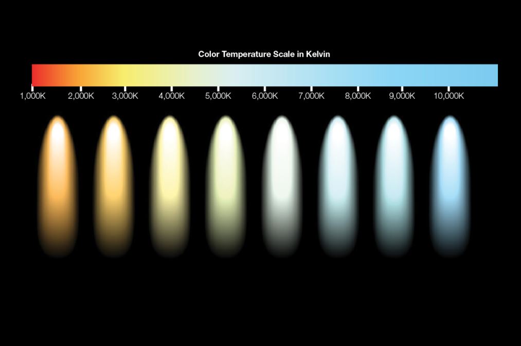
Color as emotional architecture
Color anchors memory. It gives emotional structure to visual experience, shaping how an image is remembered long after it is seen. Warm hues often evoke familiarity and closeness, while cooler tones suggest distance, clarity, or contemplation. The relationship between these temperatures creates narrative tension and release.
Color decisions begin before post-processing. They originate in awareness of atmosphere, environment, and emotional intent. Studying color as structure rather than decoration allows images to communicate more precisely. Each hue functions as a doorway or a boundary, guiding the viewer’s emotional movement through the frame. Harmony emerges when color listens as much as it speaks.
Shadow as structure
Shadow gives light its voice. Without darkness, form collapses into flatness. Shadow introduces depth, texture, and mystery, allowing the eye to travel slowly rather than consume instantly. What remains unseen becomes as important as what is revealed.
Studying shadow is an exercise in restraint. It asks the photographer to trust suggestion over explanation. In visual design, this principle translates into layered depth, subtle separation, and soft transitions that mirror physical reality. Shadow becomes an architectural element, shaping space and emotion without drawing attention to itself.
Harmony through contrast
True harmony rarely comes from uniformity. It emerges when contrast is held with intention. A photograph rich in opposing tones can still feel peaceful when balance governs proportion. Contrast functions musically, creating emphasis without chaos.
Across a sequence of images, contrast introduces rhythm. Alternating tonal moods allows visual breathing, an emotional inhale and exhale. When managed thoughtfully, contrast strengthens cohesion rather than fragmenting the narrative. Simplicity becomes a form of sophistication, and restraint allows complexity to surface naturally.
Perception and adaptation
Human perception continuously adapts to light and color, recalibrating what feels neutral. This adaptation can be used deliberately. After extended exposure to warm tones, cooler hues appear sharper and more distant. Photographers who understand this physiological response can guide emotional flow across a series of images.
Color grading becomes choreography rather than correction. Each adjustment participates in a dialogue between biology and feeling. The camera does not record color objectively; it interprets. Recognizing this removes the illusion of neutrality and replaces it with the honesty of translation.
The spectrum
Light and color shape emotion quietly and persistently. They operate beneath language, yet their impact is immediate. When photographers learn to recognize light as character and color as memory, images gain depth beyond technique.
The practice returns to attentiveness. Seeing becomes an act of understanding rather than capture. Within that understanding, photographs move beyond surface beauty and enter the realm of empathy, where perception itself becomes the subject.